MONEEY APP
Developing the Product Experience
Brief Introduction
Moneey App is a fintech startup helping people ease payments and understand money better. I joined the team with no design system, little clarity on problems, and tight timelines, I had to move fast, and move smart.
Role:
Product Designer
My Core Responsibilities
💫 Improving and creating designs for core and new product flows (across multiple touchpoints)
💫 Creating and building design system (self-started to improve developer workflow)

Visuals
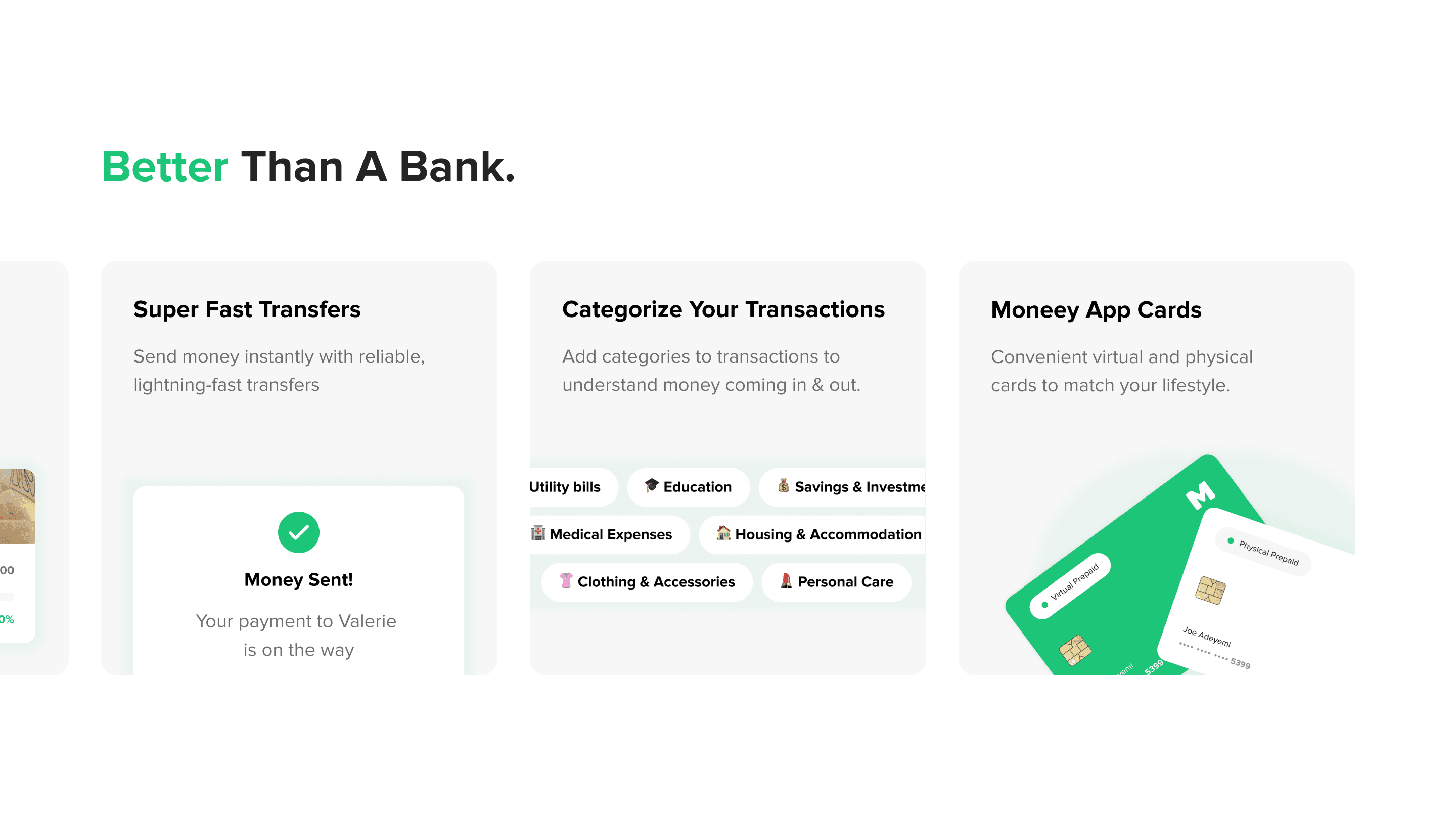
The visual goal was simplicity; designing flows that users could easily understand, navigate, and return to. This was essential for an all-in-one financial tool built for clarity and everyday use.
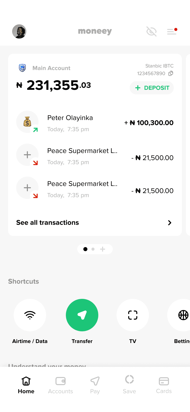

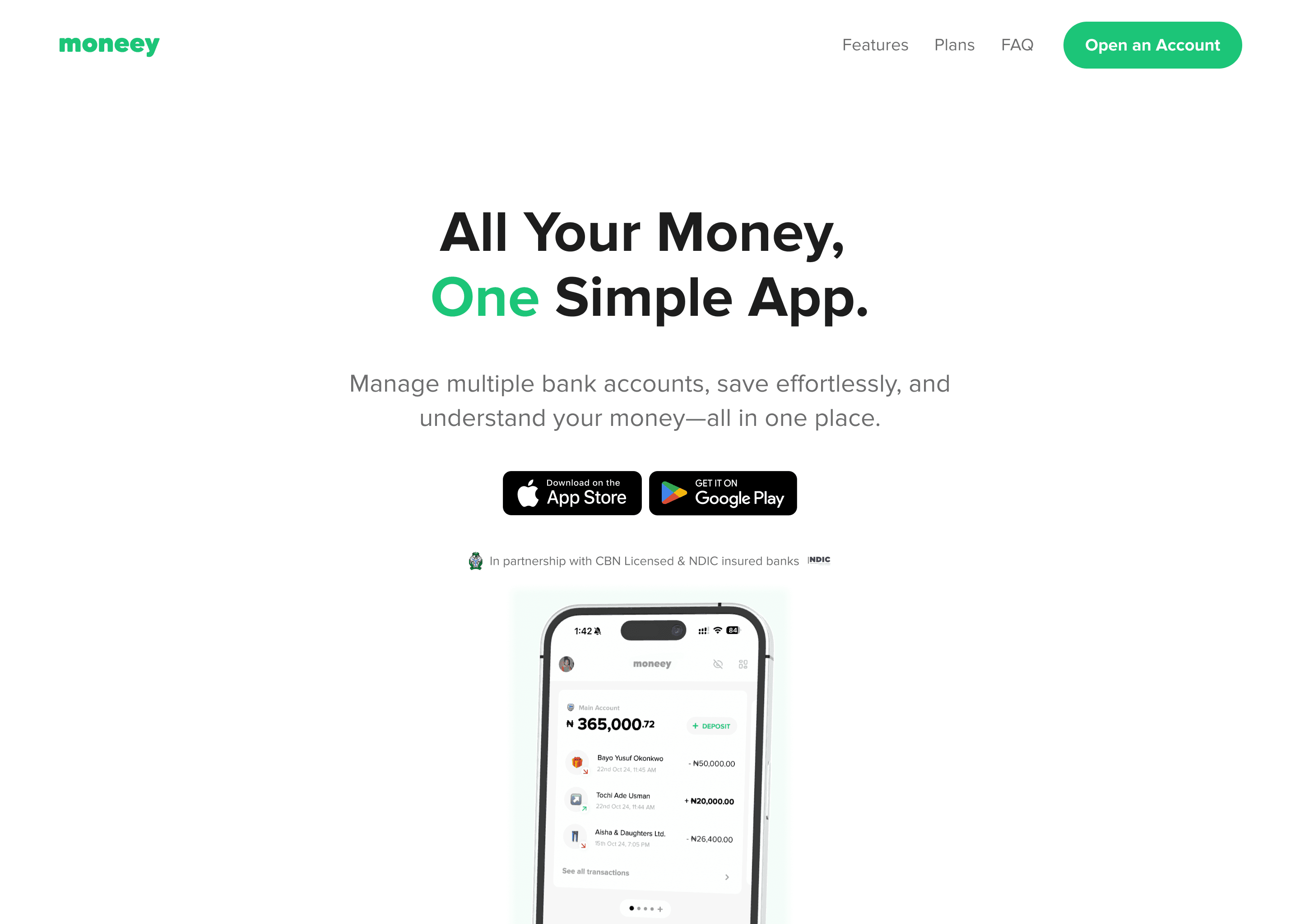


Images across multiple touchpoints (mobile, web & even documents)
Download the App:
You experience it better when you download
Work For Moneey
As the only designer, my role wasn’t limited to one feature or flow — I was responsible for shaping the product across multiple fronts. This mind map gives a quick snapshot of the core design pillars I focused on:

01.
DESIGNING FOR PRODUCT MATURITY
Reworking The Onboarding
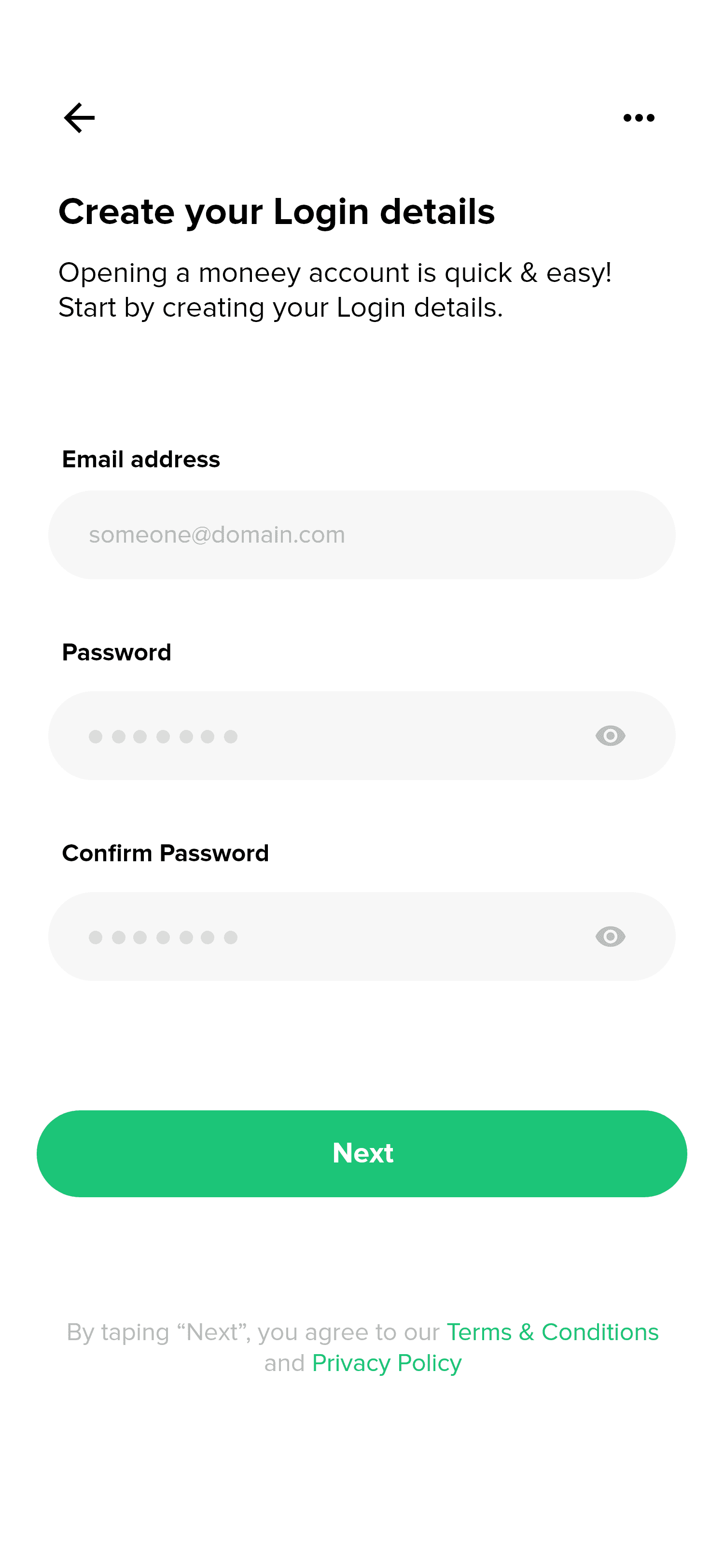
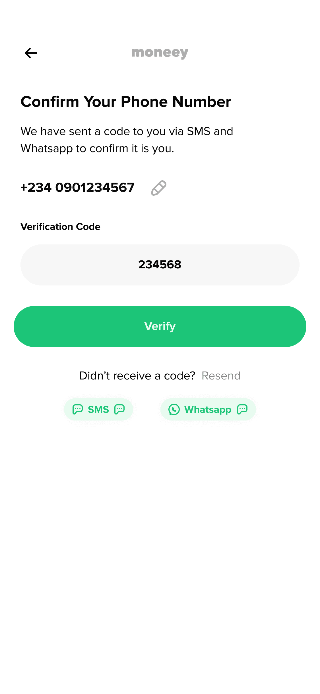
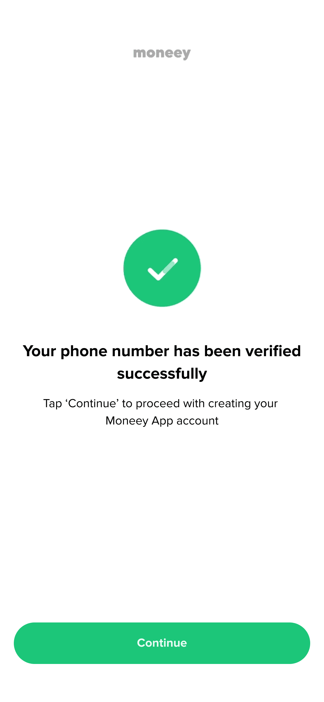
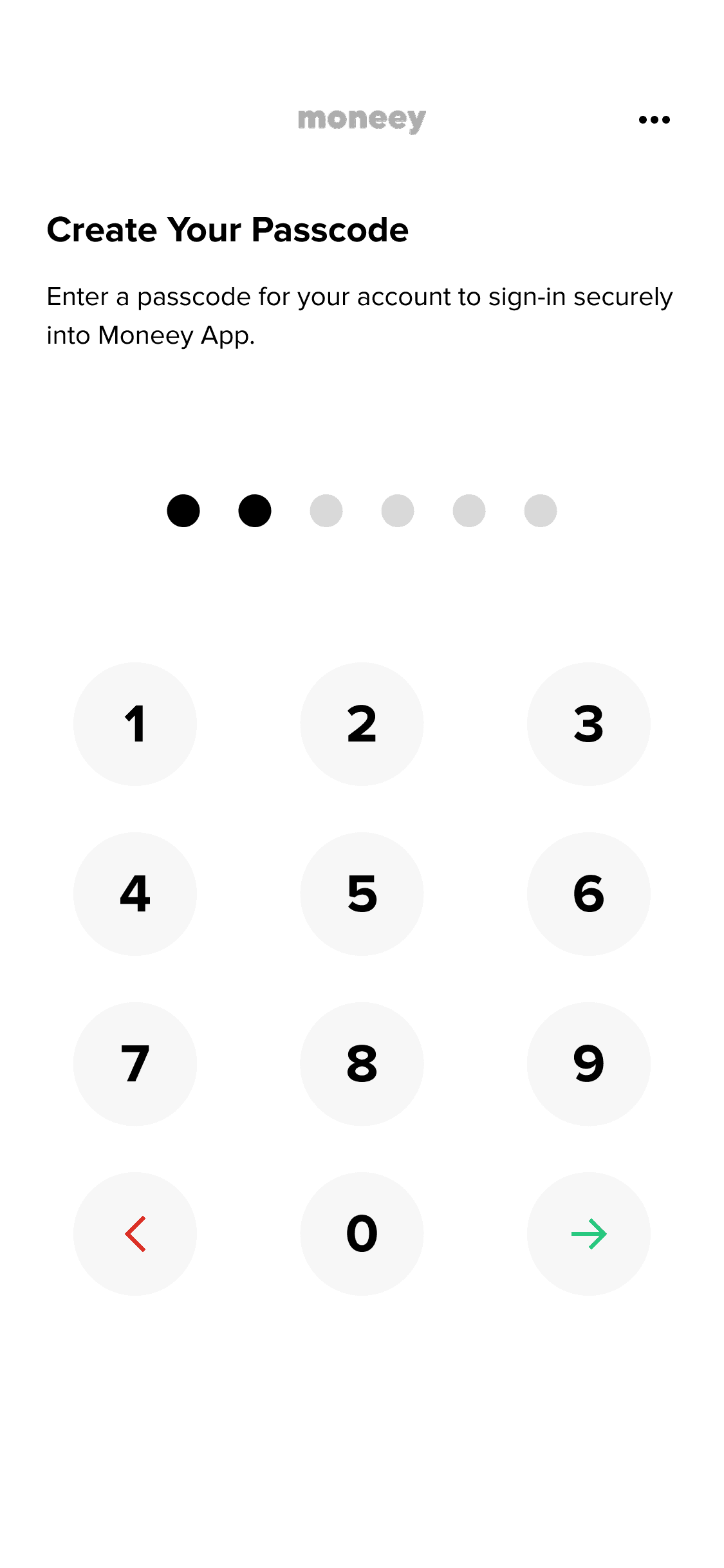
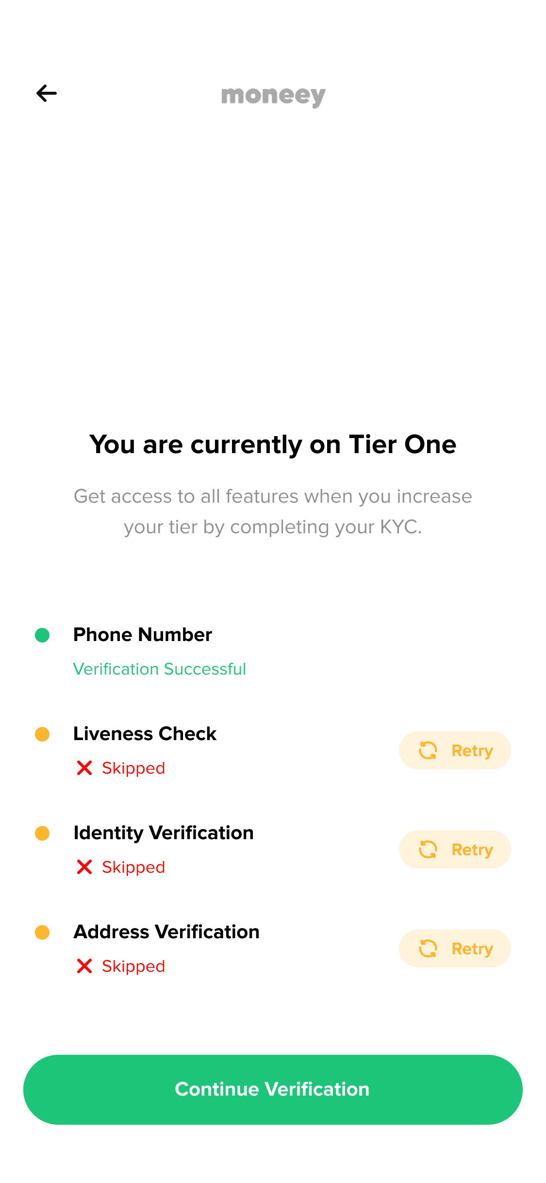
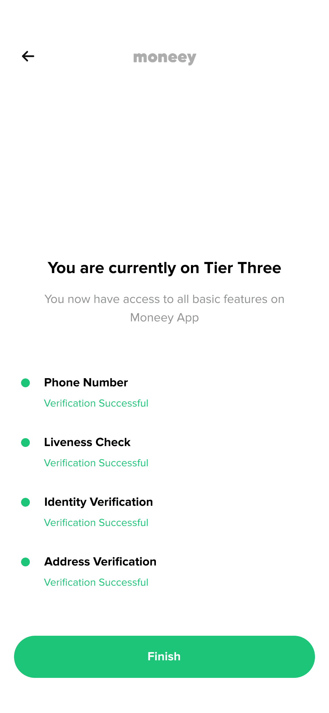
Onboarding was one of the trickiest flows I worked on. It went through multiple iterations. The challenge was finding the balance between strict security requirements and a smooth user experience. After several rounds of testing and feedback, we chose on a flow that was clear, easy to follow, and didn’t compromise on compliance.
Problems Identified
The flows were way too oversimplified & did not consider security measures.
Onboarding needs to be eye-catching; and ours wasn't
Long forms without clear guidance or progress indicators.
Along with more problems we observed using the app.

Existing onboarding before I joined the team.
❓What did we do next?
The next step was to map out a complete outline of all the onboarding flows; identifying what was missing, what was redundant, and what needed to be reworked. I collaborated closely with the product manager to audit the entire experience, align it with security and compliance requirements, and ensure we weren’t overcomplicating the process.
This step helped us trim unnecessary screens, add critical verification steps, and define a clear path for different user types (e.g., new vs. returning users, tier groups and subscribed users).


Onboarding after I joined the team.
Reworking The Onboarding
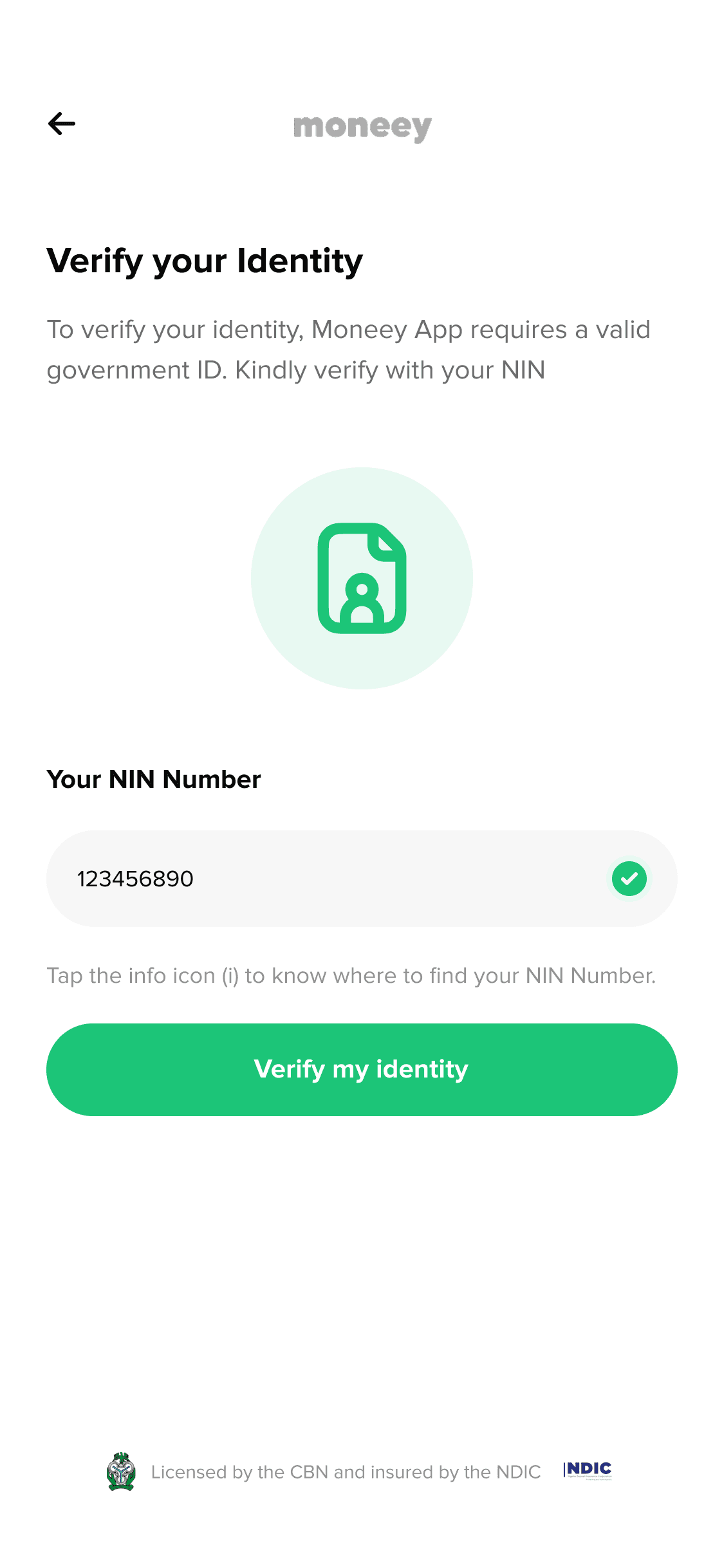
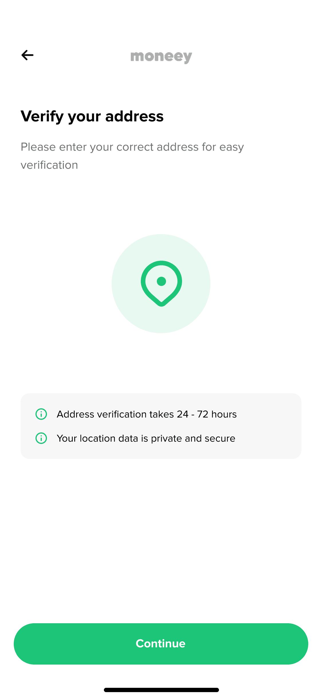
This included adding verification steps like ID upload and phone number confirmation, improving error handling, and introducing clearer progress indicators.
The Solution
This included adding verification steps like ID upload and phone number confirmation, improving error handling, and introducing clearer progress indicators.
We also included colored images on our splash screens requiring a photoshoot to be conducted.