BEAUTYHUT AFRICA

Increasing User Engagement & Reducing Cart Abandonment

BeautyHut Africa is an online beauty marketplace focused on skincare, makeup, and haircare products.

I was contracted to redesign the basket feature to help reduce cart abandonment and improve checkout flow. Alongside that, I was also tasked with designing a new gift card feature; giving users a simple, thoughtful way to share & gift beauty products to others.

FIRST CHALLENGE

Redesigning the Basket feature to reduce cart abandonment and improve users' checkout experience.

Despite strong traffic and interest in BeautyHut, there was a noticeable drop-off between users adding items to cart and completing their purchase. We had to come up with a slight but different approach.

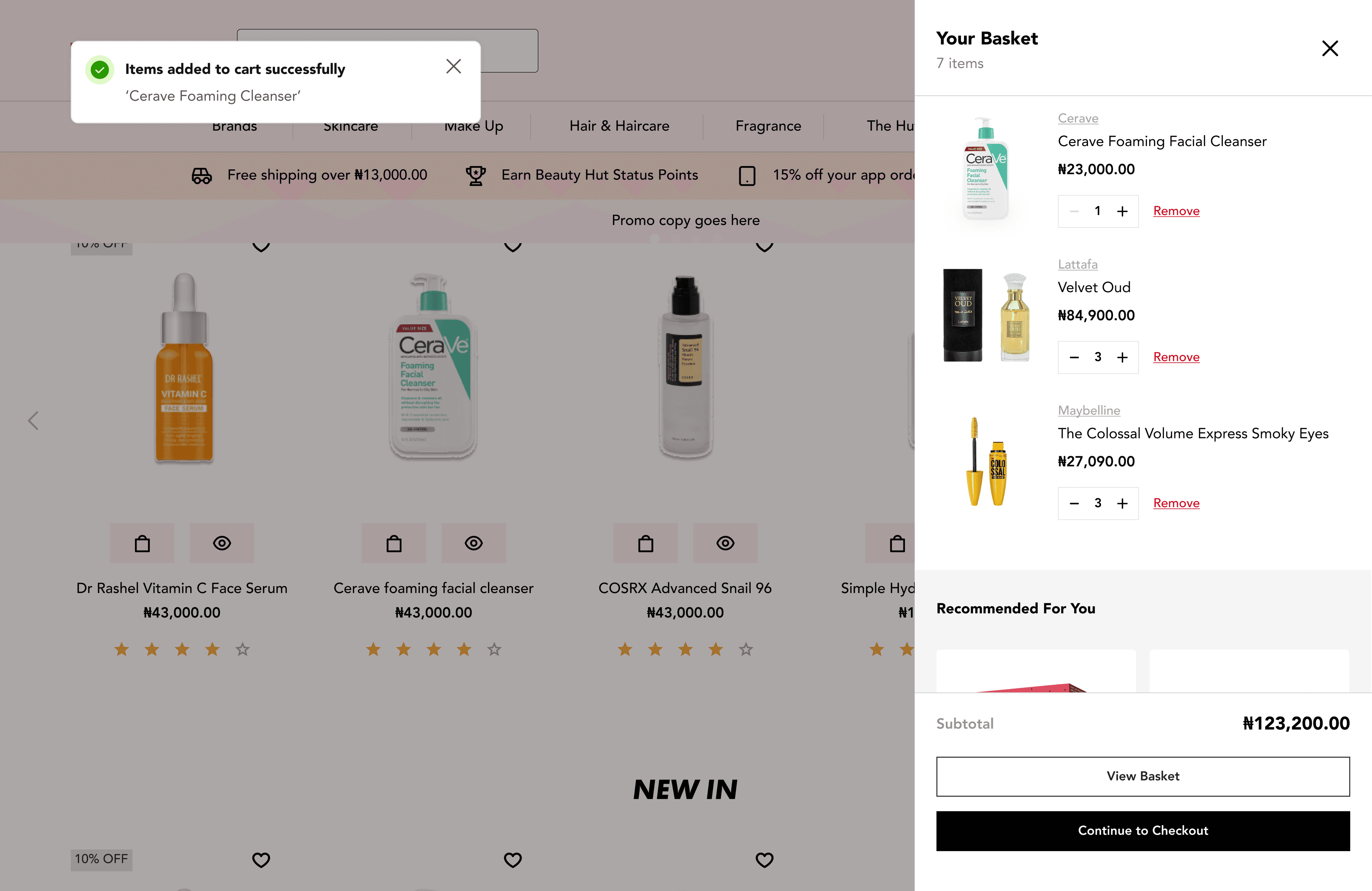
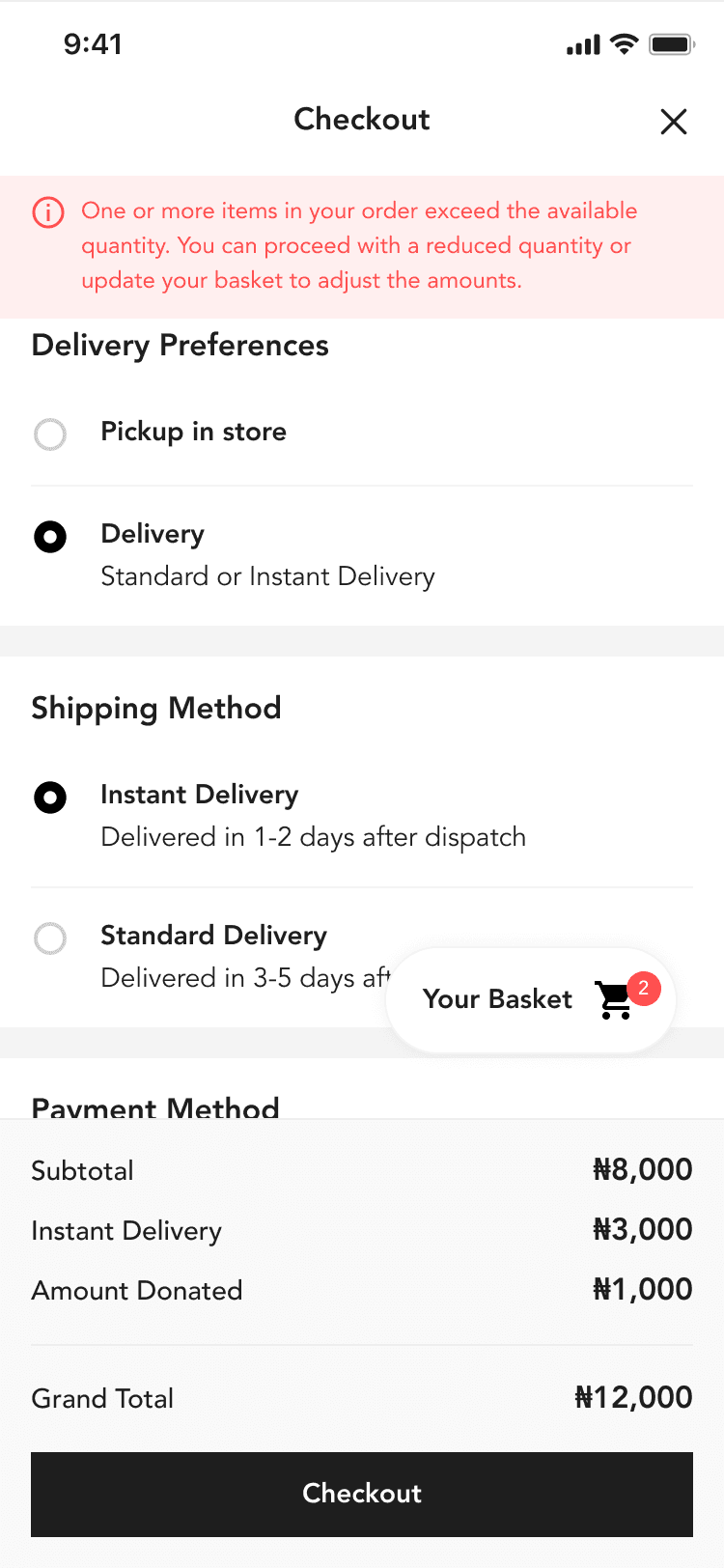
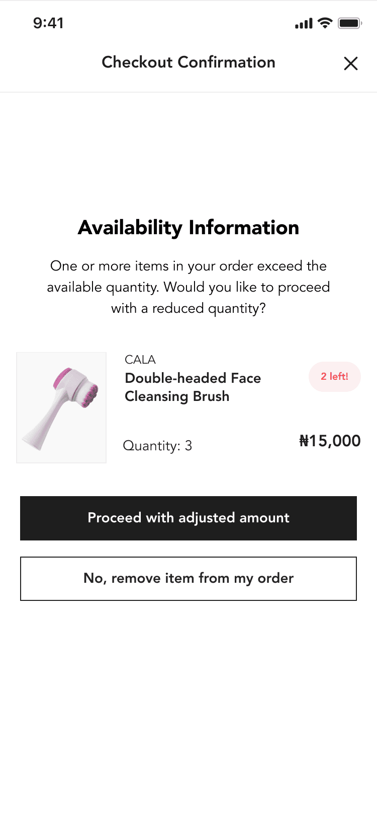
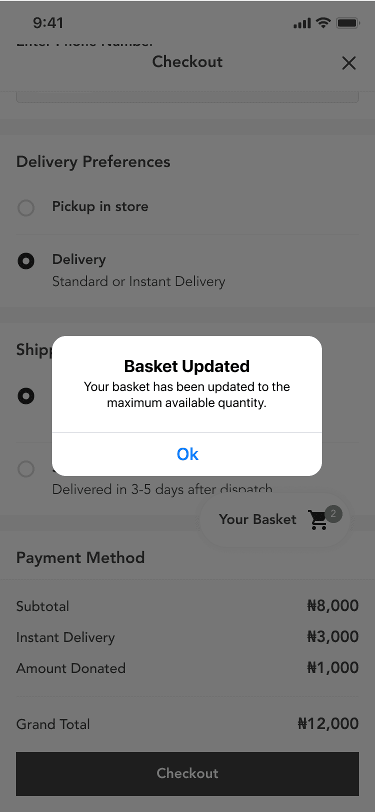
Visuals From The Project (Mobile & Web)

⚠️ The First Step

I began by auditing the entire cart-to-checkout experience to identify friction points and missed opportunities. I reviewed the UX across mobile and desktop, focusing on layout, clarity, and decision support. I also explored similar beauty e-commerce platforms to benchmark patterns and expected behavior.

❌ Problems Identified

While users were actively browsing and adding items to cart, many weren’t completing checkout. We highlighted a major issue.

Lack of Quantity Clarity Across Warehouses:
They operate two warehouses in different locations in the city, which meant stock levels varied and were dependent on one store. However, the basket experience didn’t communicate this clearly.

🔒Case Study In Progress

There'll be a deep dive! Do come back when you can!

🔒Case Study In Progress

There'll be a deep dive! Do come back when you can!

🔒Case Study In Progress

There'll be a deep dive! Do come back when you can!

SECOND CHALLENGE

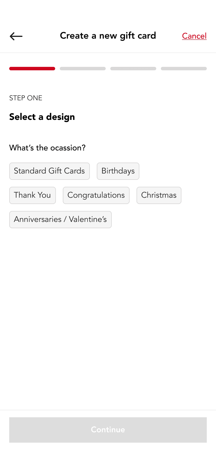
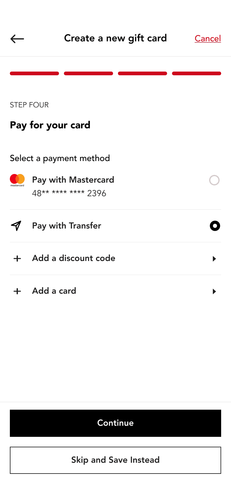
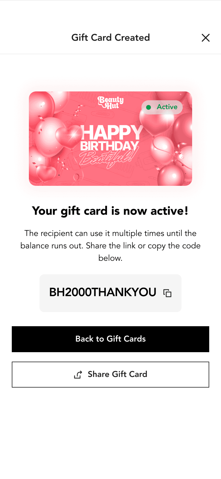
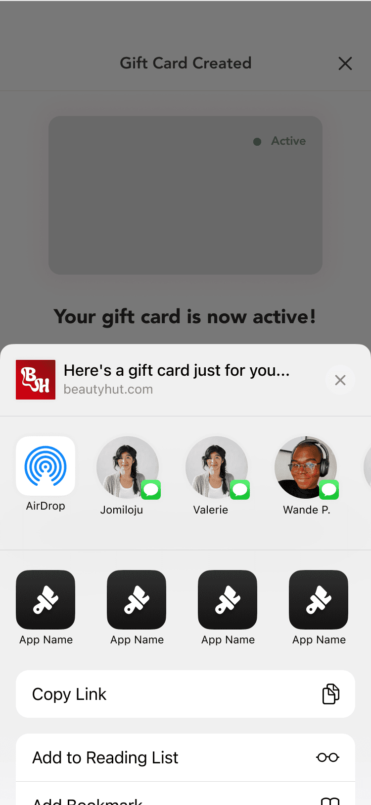
Increasing User Engagement Through BeautyHut Gift Cards

I designed the gift card flows for both mobile and web, focusing on keeping it clear and easy to use. Users could choose an amount, add a short message, and send it via email or link.

The goal was to make the process straightforward while still feeling personal, without adding extra steps or distractions.

Resolved Visuals

🔒Case Study In Progress

There'll be a deep dive! Do come back when you can!

🔒Case Study In Progress

There'll be a deep dive! Do come back when you can!

🔒Case Study In Progress

There'll be a deep dive! Do come back when you can!

© nudsgnr. 2025.

built with

by

Nenye Uba

© nudsgnr. 2025.

built with

by

Nenye Uba

built with

Nenye Uba

by